Duenix: subscription control and no stray charges

Europe and the US
iOS + Android
6 weeks to release
Flutter · Firebase · Firestore
Duenix
Duenix
Duenix
The brief

What the client came with

People lose money on forgotten subscriptions, and trackers make them enter everything by hand.
PROBLEM 01
$219 a year leaks into forgotten subscriptions
On average a user loses $219 a year on subscriptions they never use (Chase and Nielsen data). Charges are noticed only after the fact.
PROBLEM 02
Trackers make you enter everything by hand
Competitors make you type in the name, price and date for every subscription. The barrier is high and few people get to the end.
PROBLEM 03
No warning before a charge
Existing apps either keep a list of subscriptions or add up spending, but they never warn you about the next charge in advance.
The product

The final result

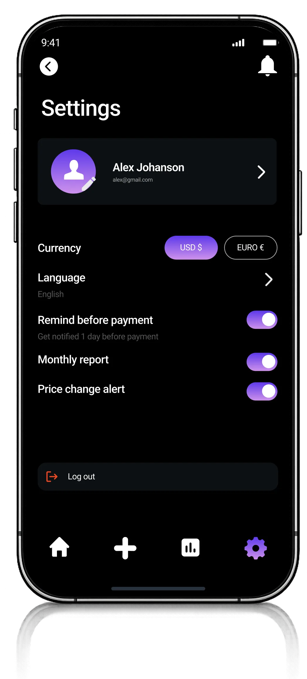
Duenix screen
Duenix screen
Duenix screen
Duenix screen
Duenix screen
01. Research

Research and customer interviews

We studied 7 competitors and ran 10 interviews with users aged 22-40.

Key finding: people do not want to add up expenses after the fact, they want to see upcoming charges in advance and cancel the extras in a couple of taps.
Where competitors fell short: they either keep a list of subscriptions or add up spending, but never both, and never warn you in advance.
What the research showed
People do not want to keep spreadsheets by hand. They need to see upcoming charges in advance and cancel the extras in a couple of taps, and competitors do not offer that.
Research outcome
7
competitors analyzed
10
interviews conducted
2
key insights
02. Beta test

Tested in a beta

We built the app and handed it to beta testers before publishing it to the stores.

On real users: 20 beta testers, 6 weeks. We watched whether they reached adding a first subscription.
No risk after that: the beta closed 4 UX fixes before publication.
What the test showed
Users added a first subscription in about 1.8 minutes through the catalogue. 4 UX fixes went in before release, and publication to both stores passed with no critical bugs.
03. UX/UI design

A home screen that shows everything at once

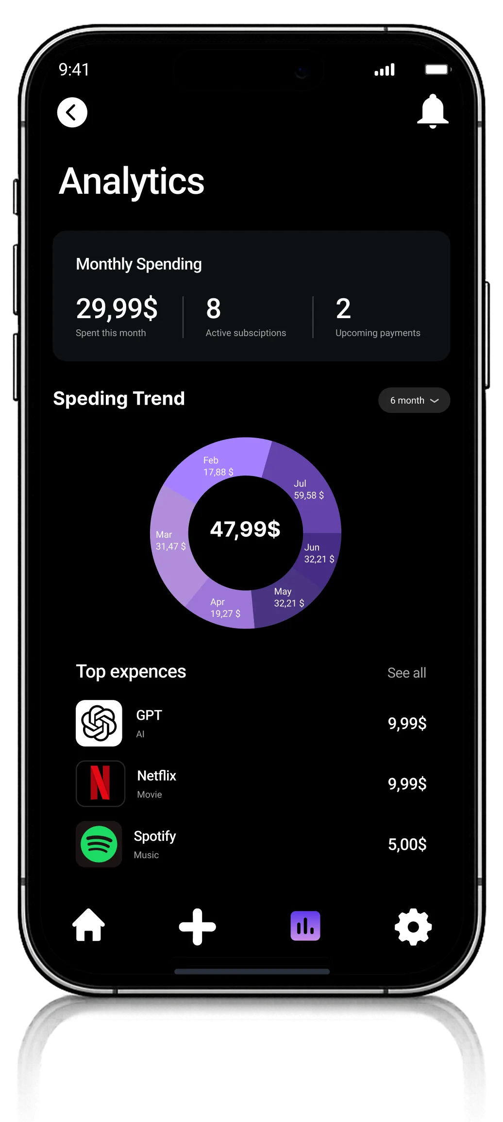
We designed the interface so that upcoming charges and spending totals sit on the home screen, with no extra navigation.

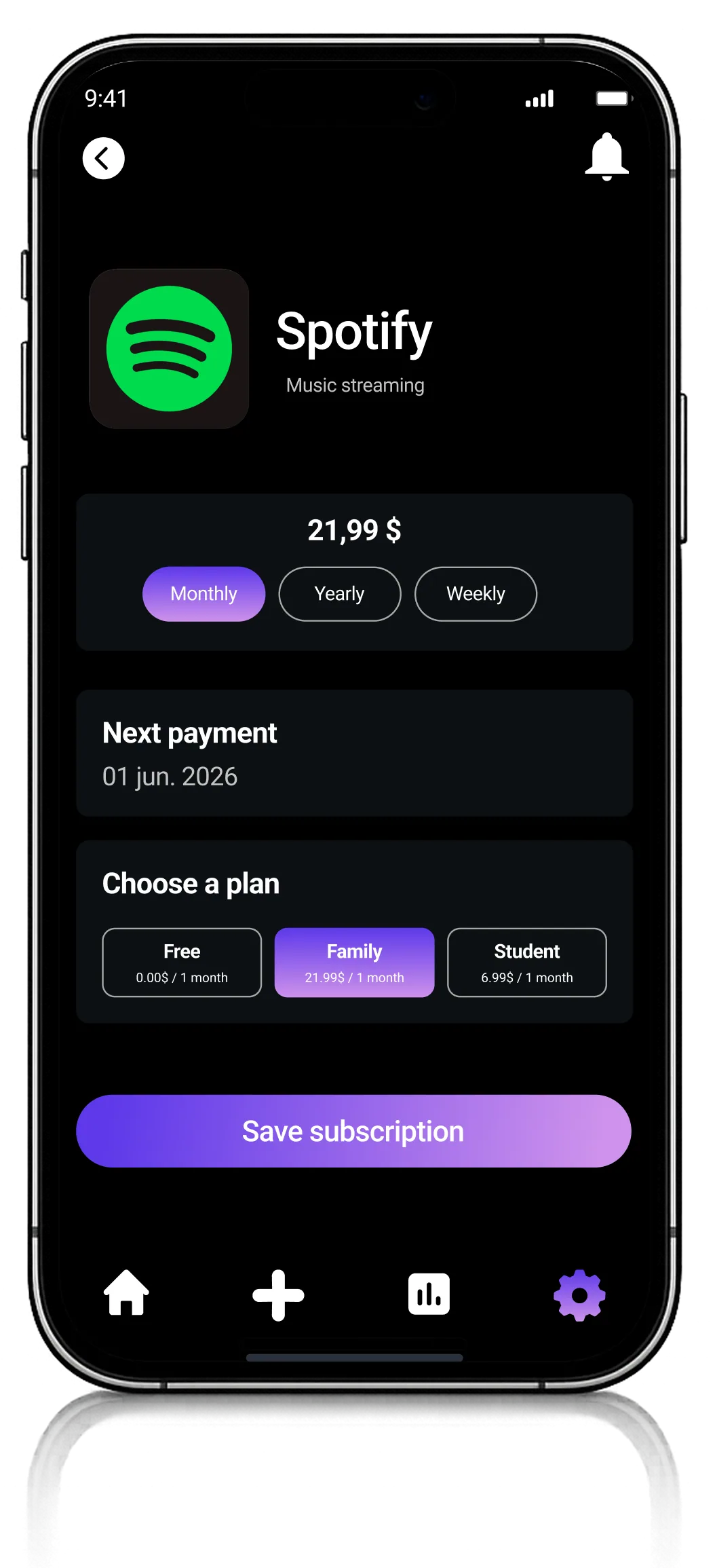
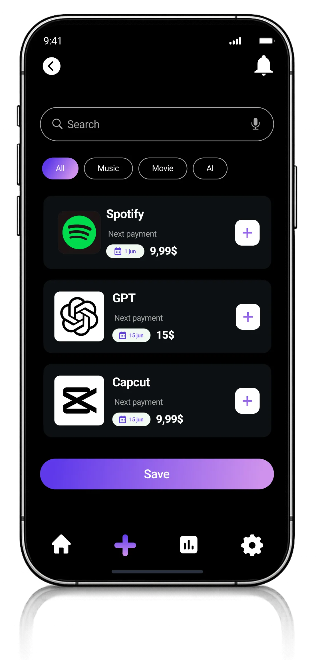
Adding one in 3 steps: name → date → price from the catalogue, about 1.8 minutes.
A push at the right moment: a reminder 3 days and 1 day before the charge.
Duenix subscription catalogue
Before / After

What changed for the user

Users used to learn about a charge after the fact. The app shows charges in advance and helps cancel the extras.

Before
$219 a year leaked into subscriptions nobody uses
Every subscription had to be typed in by hand
Charges were noticed only after the money had gone
The subscription list and the spending count lived in different apps
After
Adding a subscription from the catalogue in ~1.8 minutes, with no manual entry
A push 3 days and 1 day before the charge, nothing slips through
A list of subscriptions and spending analytics on one screen
Works even offline, syncs across devices
34% of users found and cancelled forgotten subscriptions in the first month
Outcome

Results in numbers

The first 60 days after release

$219
average yearly saving per user
The app shows what the money goes to and what can be cancelled
34%
of users cancelled forgotten subscriptions
In the first month after installation
1.8 min
to add a first subscription
A catalogue of 200+ services with automatic pricing
Let's talk

Want the same result?

Tell us about your project. We reply within one business day and set up a call.